London Public Library: Beyond the Books
Libraries are a critical part of communities, providing the social infrastructure that benefits new mothers, newcomers, seniors, young children, teens and everyone in between. The London Public Library’s role is no different, certainly a place for books and reading, but more and more the go-to destination for diverse community programming.
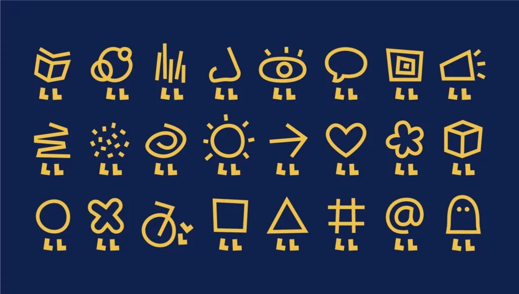
BMD created a flexible identity that celebrates this notion with a playful and engaging dynamic logo. The two “L”s in the shortform (LPL) do double duty as a set of legs, carrying the “P”, drawn as a speech bubble to emphasize dialogue and community engagement. The ‘P’ can change form, creating a variety of anthropomorphic characters that can represent the many aspects of the LPL in a light and lively way.


The Library…is more and more the go-to destination for diverse community programming.


“THIS NEW IDENTITY BROUGHT LIGHT AND JOY TO OUR TEAM. IT’S LIKE A BEACON, LIGHTING OUR WAY.”Ellen Hobin, Communications Manager, London Public Library
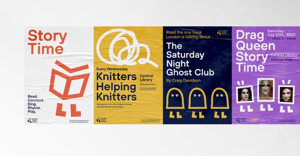
The system is simple and easy to use, and the Library can create more illustrations as they create new programming. These plug-and-play assets are perfect for an organization with a small marketing budget but a big ambition to welcome everyone.


